
L3 Home — Revisited
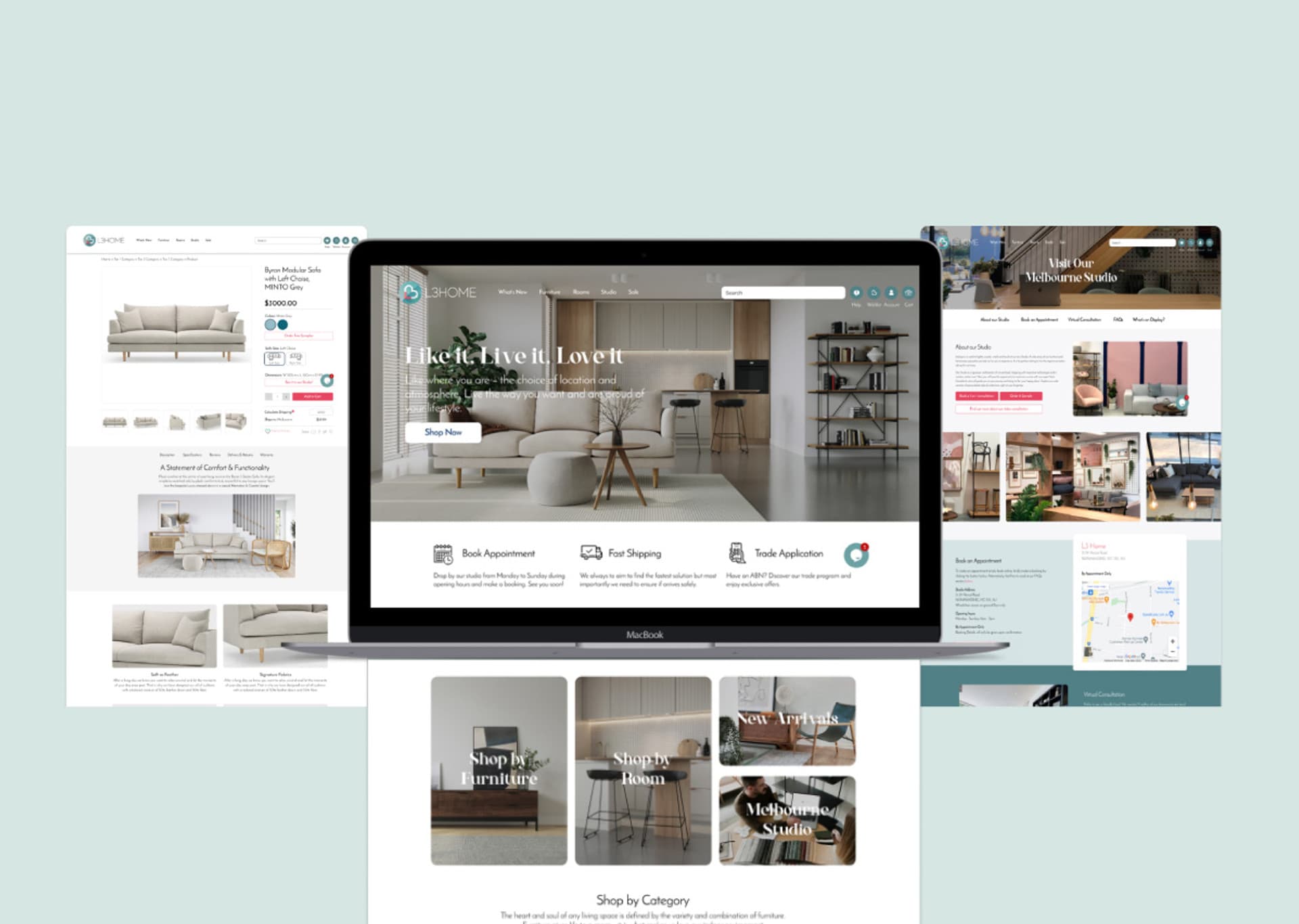
To improve L3 Home's customer experience on the website while shopping for furniture online, making the process of purchasing a high-ticketed product such as furniture easier for visitors.
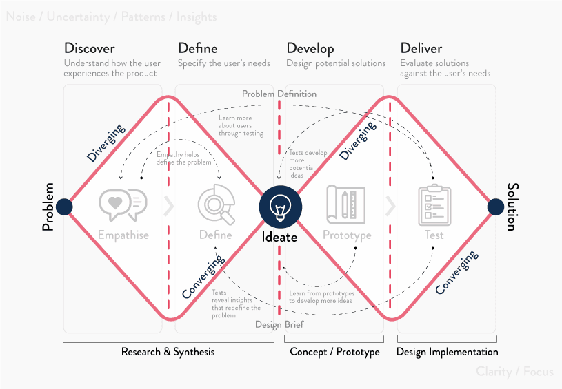
We adopted the Double Diamond process throughout the journey of this exercise.
Client Background
L3 Home is a family-owned furniture wholesale/retail brand spanning over 30 years of history, carrying a strong passion for design and a distinctive selection of furniture intended for Australian living at affordable price.
As the core of the business shifted to more eCommerce-oriented wholesale clients, the company looked to expand into eCommerce to reach a new generation of audience. Their last full-fledged retail store had already closed in the early 2010s, so this was a fresh start.
The first iteration of the website launched in February 2020, right before COVID-19 impacted Australians' lives. With everyone locked in for most of the year, an unexpected demand for home improvement — and furniture — followed, and L3 Home generated record revenues across both wholesale and online channels.
Challenge and Objective
Shopping for furniture online can save time and let customers explore options all at once, but it carries concerns. Furniture is a bulky item and a larger investment, and most Australians still prefer to walk in before purchasing, as furniture is a very sensory experience for some.
Realising the potential and importance of an e-commerce presence, I undertook a UI/UX exercise to further improve the customer's experience while shopping for furniture online.
Problem Statement
Shoppers lack confidence when it comes to buying furniture online. They want to know more about the product(s), but often find that the information available while shopping online is not enough.
Research and Analysis
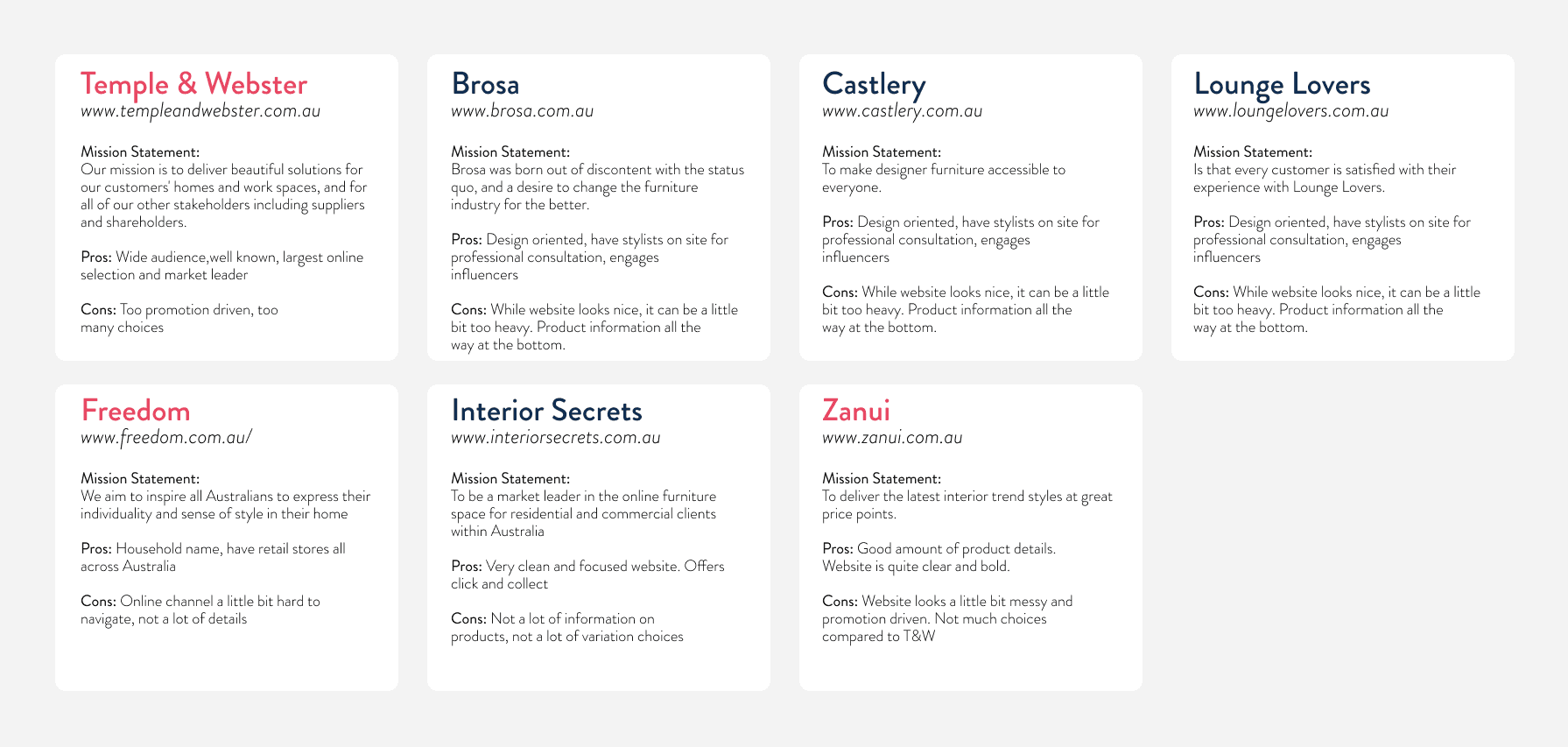
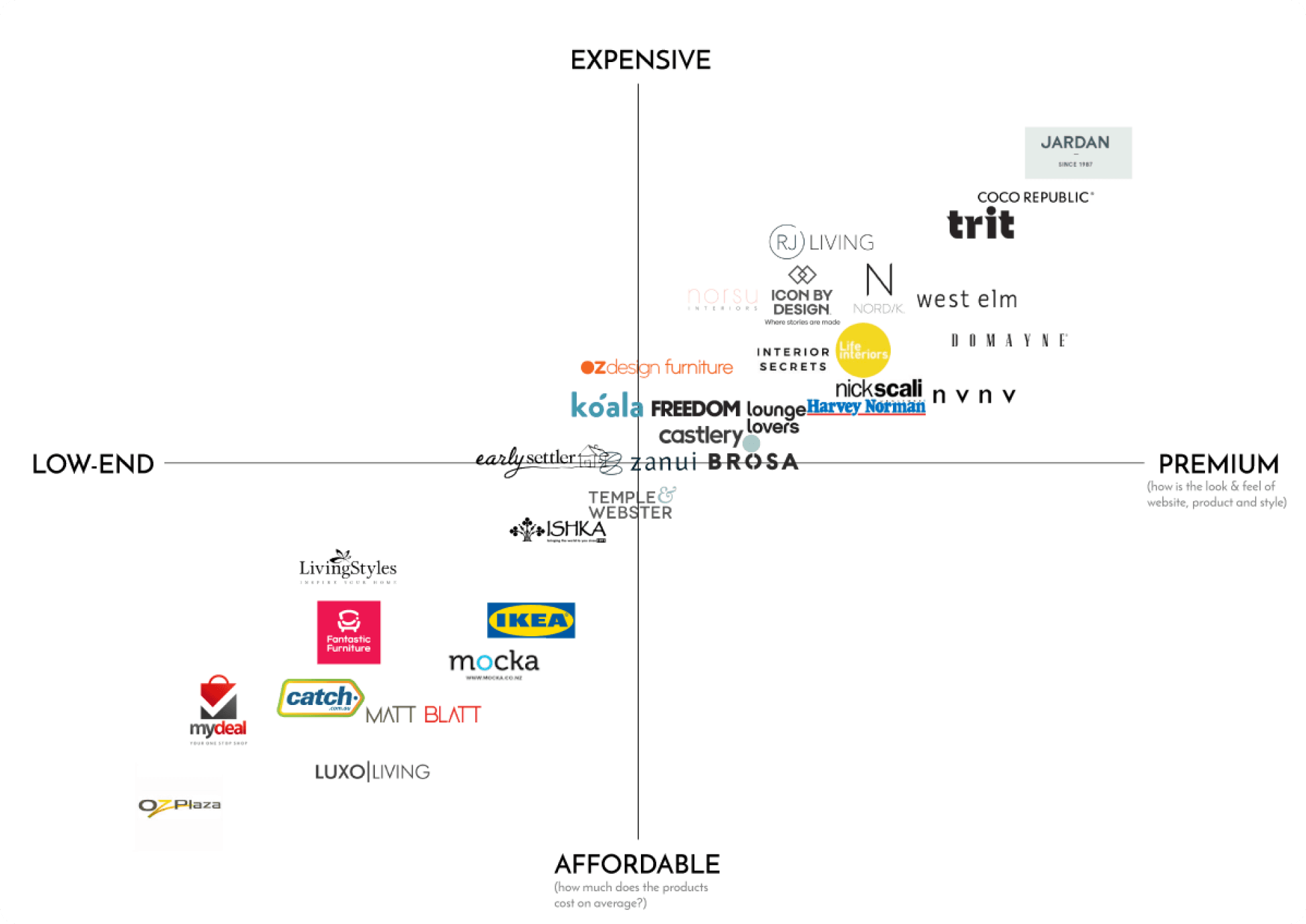
I began with thorough research on the industry and competitors, analysing user experiences on each website to find what worked and what didn't. We also conducted a brand matrix to see where L3 Home should position itself — useful for wireframing and brand identity later.
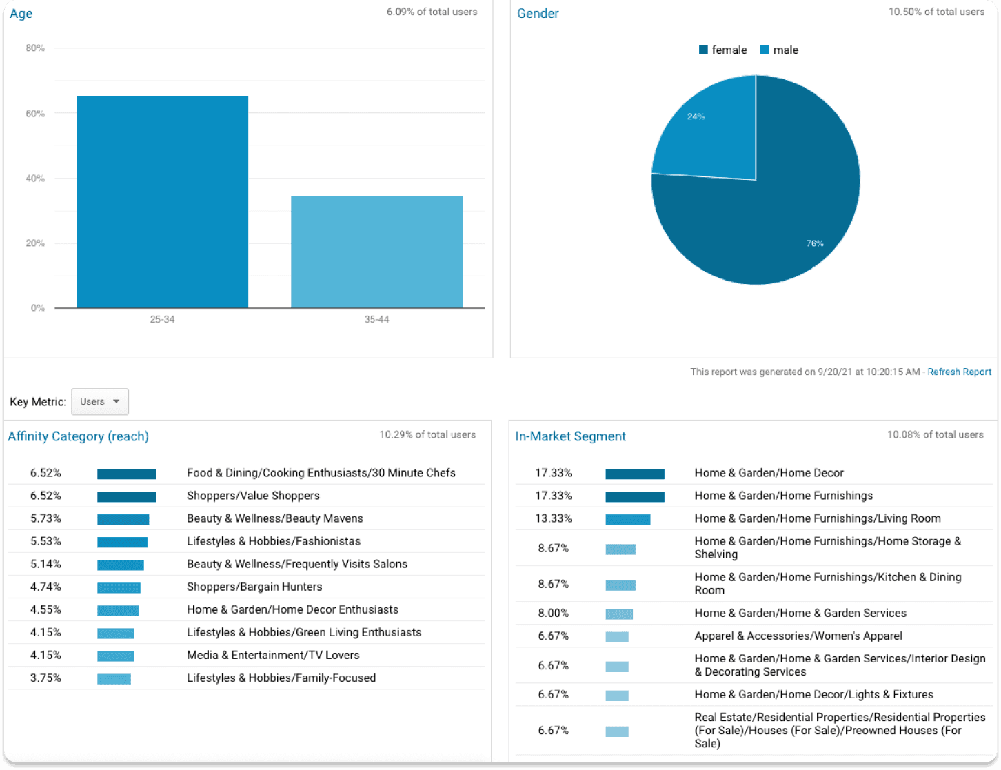
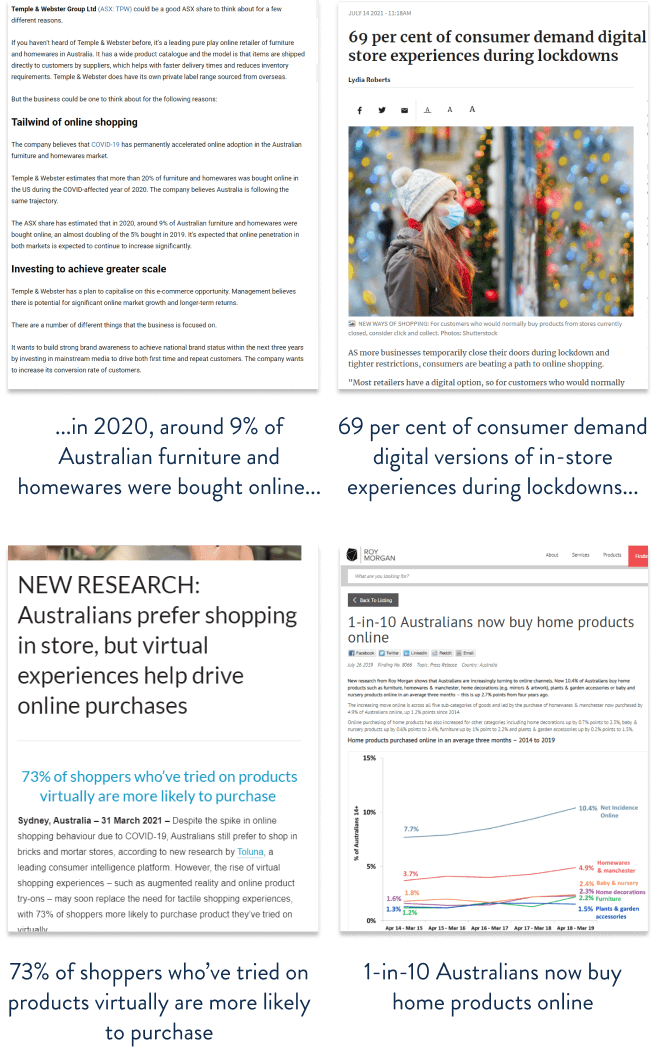
We conducted 1-on-1 interviews and online surveys to understand the demographic and personal shopping journey better, which helped synthesise insights at the defining stage. Google Analytics on the existing site reinforced our target audience and age group, and market trends research helped back up the stakeholder's position in the market.
Insights
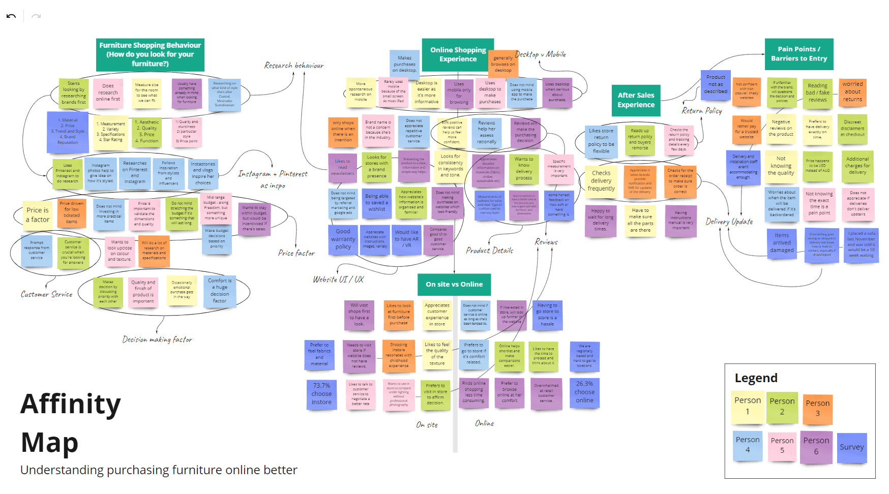
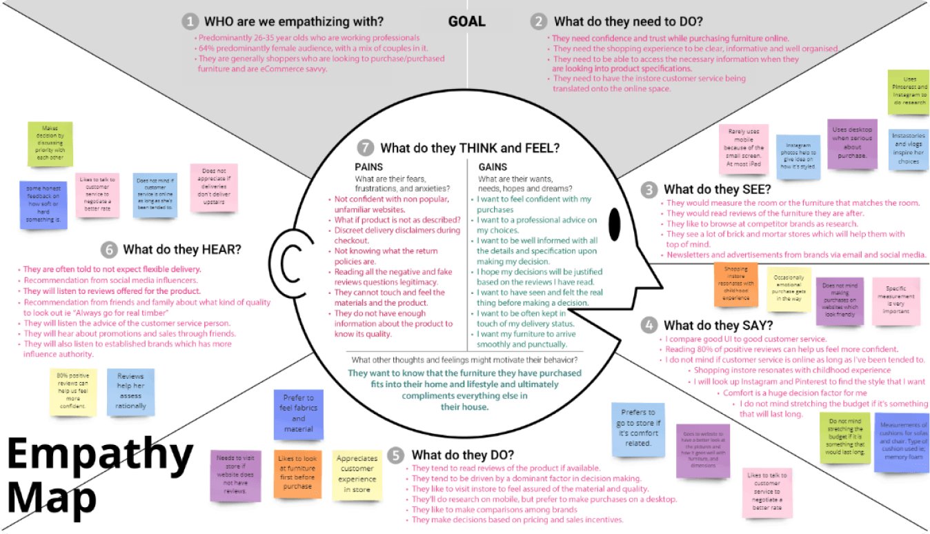
Collecting all the pieces of information from research, I built an affinity map and later an empathy map to synthesise findings into insights that would help define the problem space, using key questions raised during research to group them into categories.
Four key insights
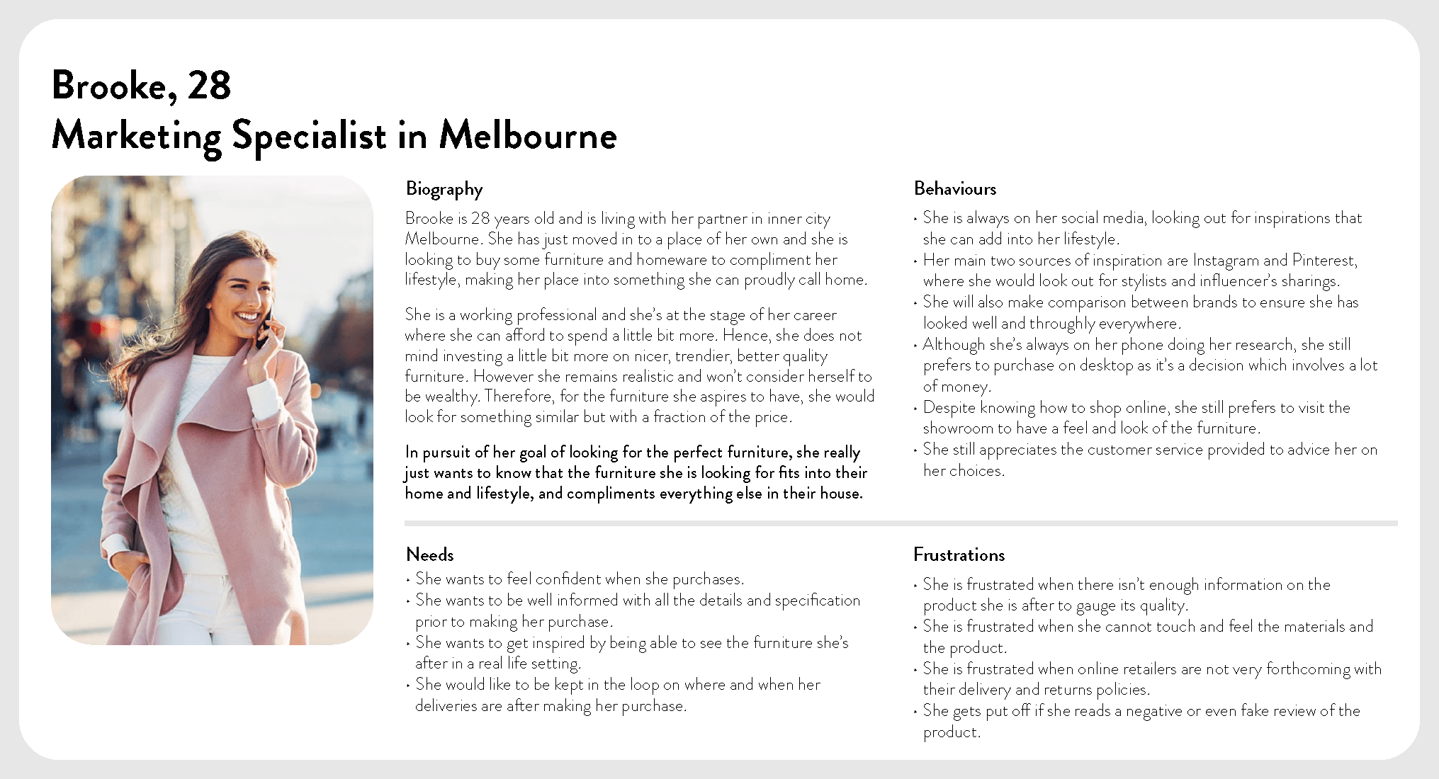
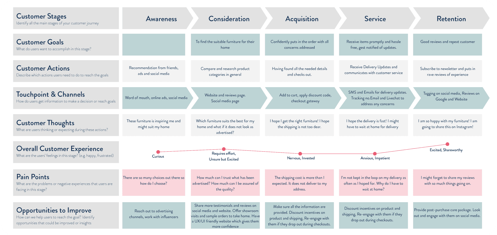
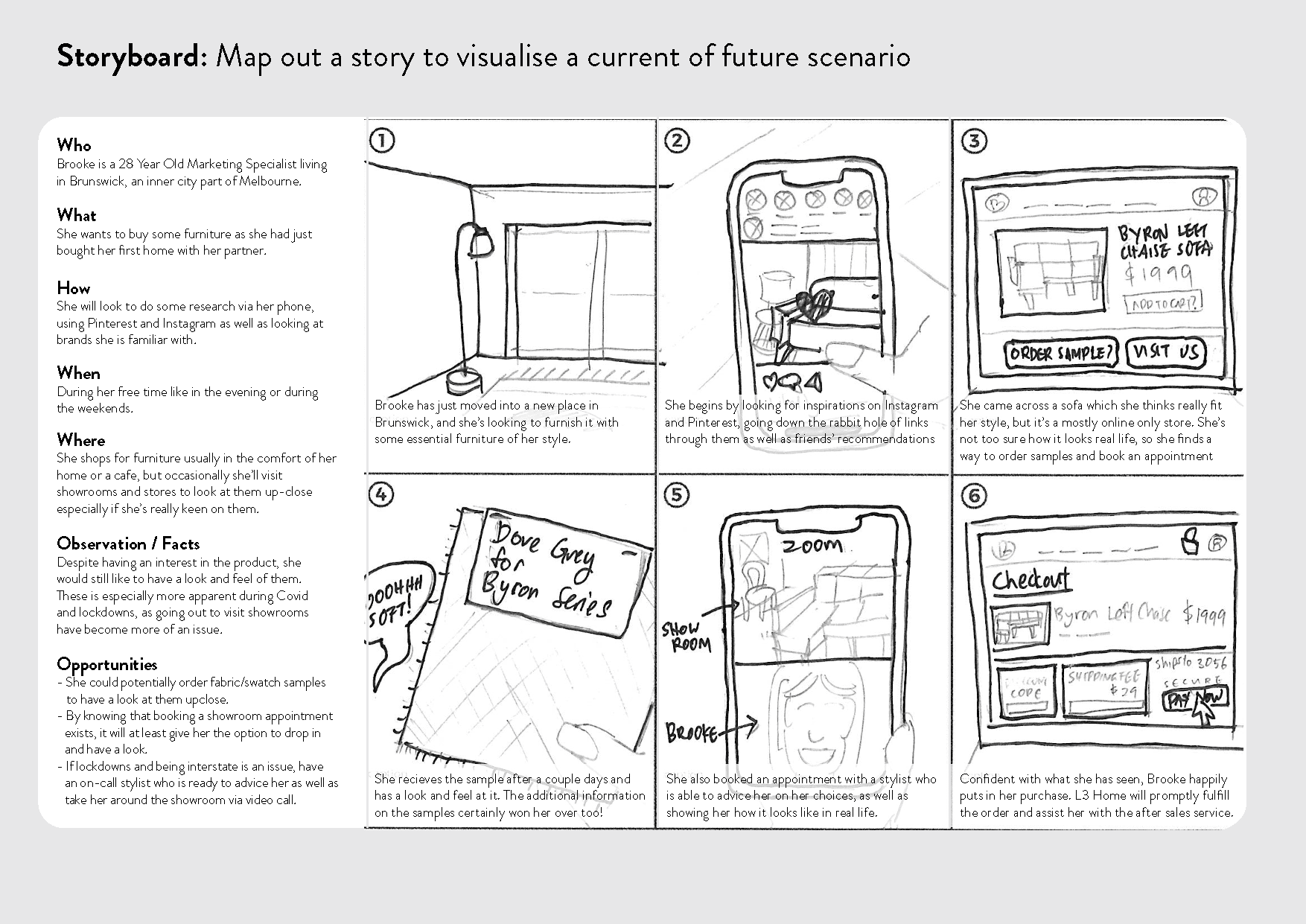
From these insights, we built a primary persona named Brooke — a 28-year-old working professional — and mapped her customer journey, identifying pain points. Brooke faces the most challenges from the Consideration to Service stage.
How might we offer customers a comprehensive experience while shopping for furniture online so that they can feel confident and well assured during the process?
Ideation
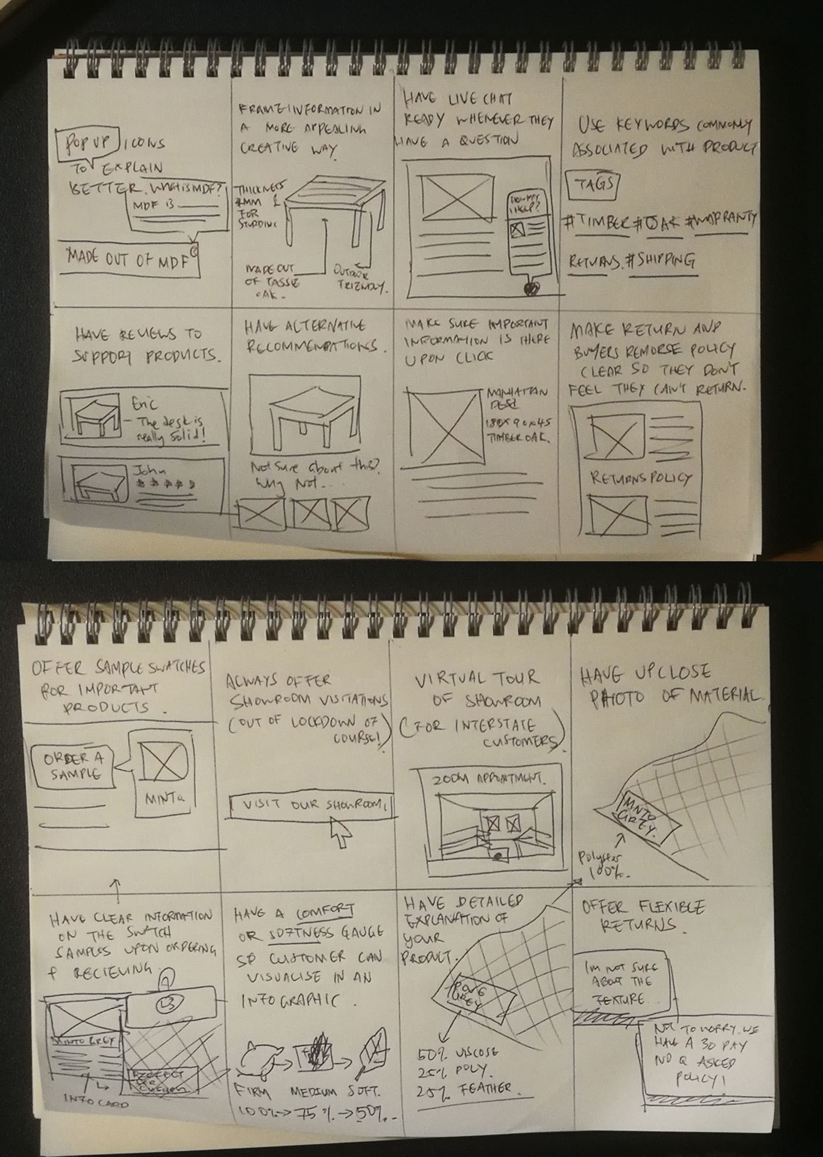
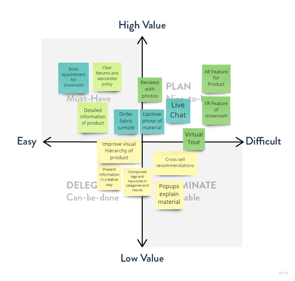
We used Crazy 8s and storyboarding to ideate around the How Might We question, then filtered the more interesting ideas into a Minimum Viable Product matrix to prioritise them.
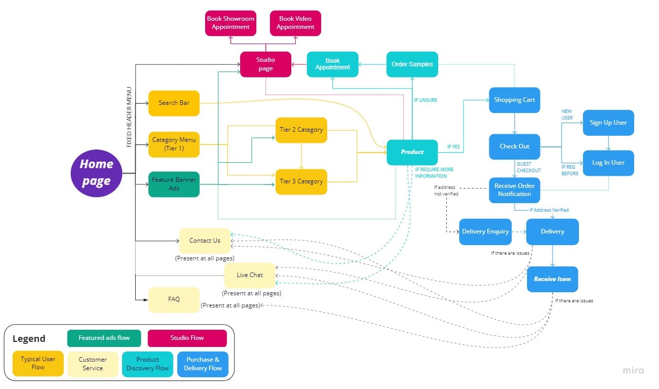
User Flow
I developed the user flow to show how Brooke would navigate the website to reach products and the studio page. While a familiar flow for a typical ecommerce site, certain elements needed to be present on every page in case the user got stuck and needed assistance.
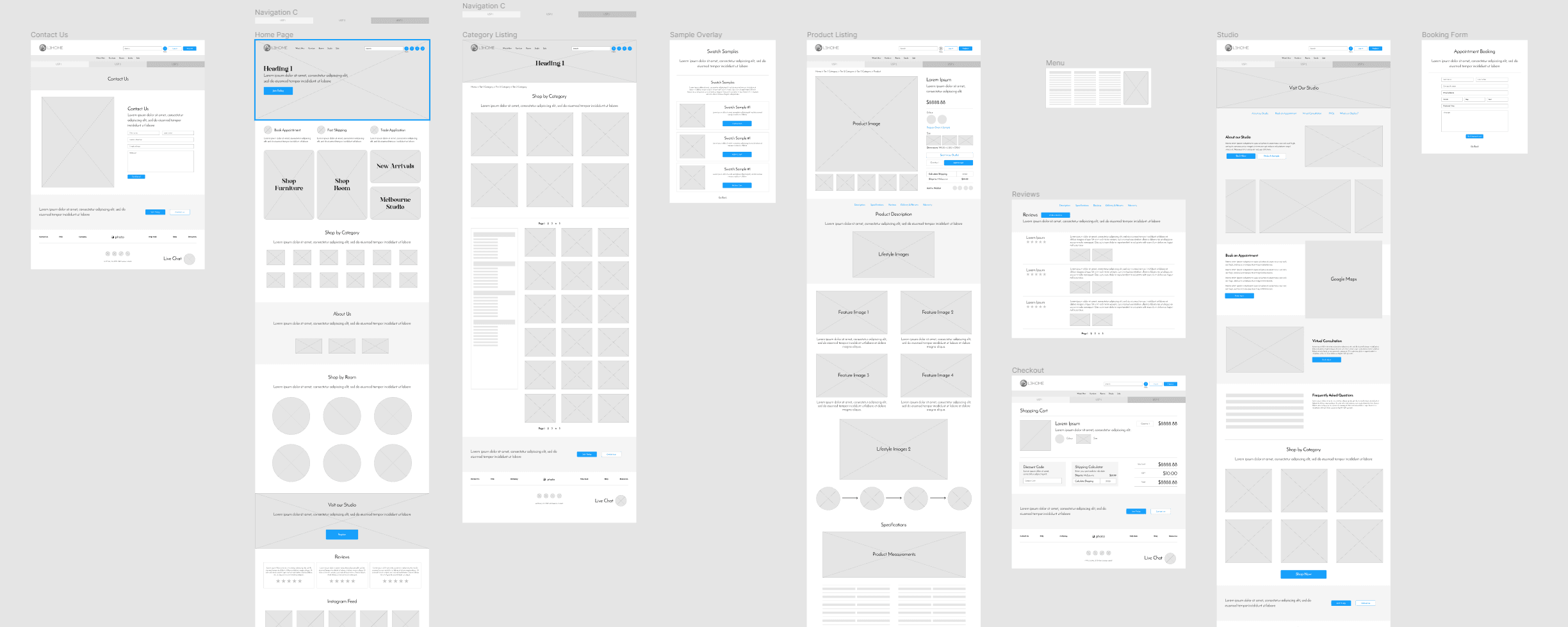
Lo-fi Wireframe
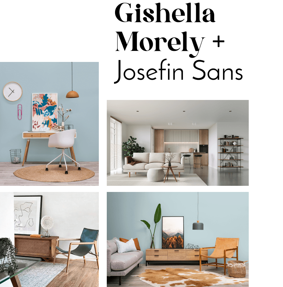
Brand Identity
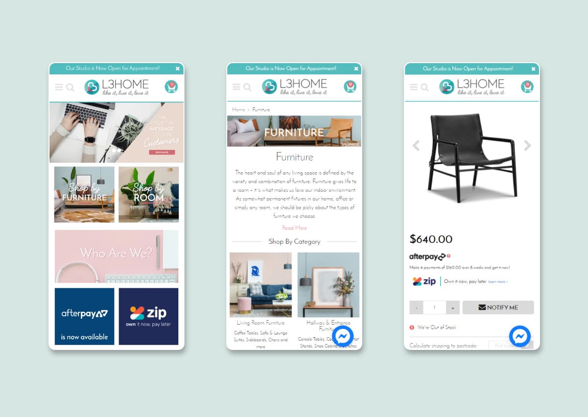
We revisited the brand's visual identity from the existing iteration to be more relatable to the persona. Alongside maturing the calm, balanced primary teal colour, we added Gishella Morely as a heading font to bring more character, complementing the existing Josefin Sans.
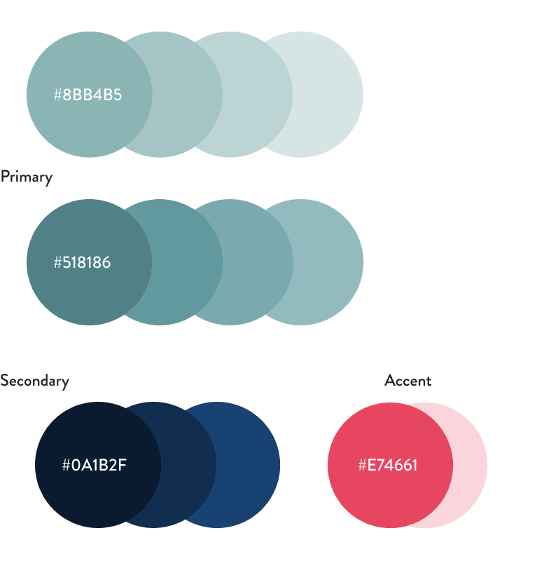
After finalising ideas and revisiting the brand identity, I expanded the low-fidelity wireframe into a high-fidelity wireframe.
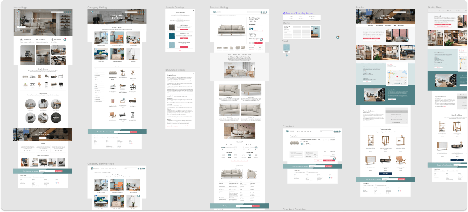
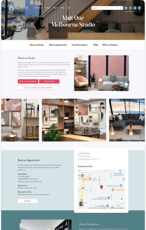
I focused on the Product page as the main touchpoint where users find out the most about a product, while the Studio page gives users a chance to get to know the product and brand better, letting them book appointments virtually or on-site.
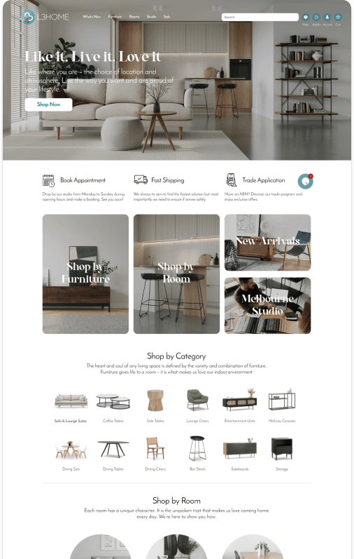
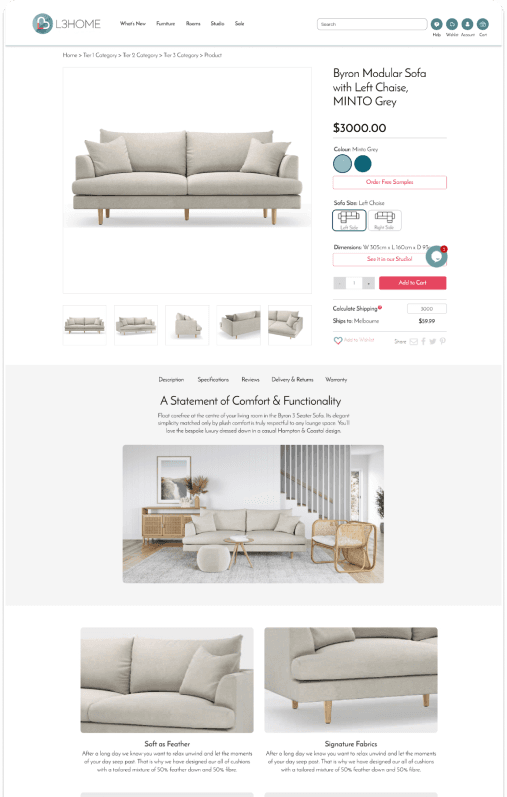
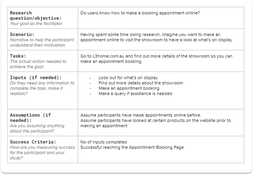
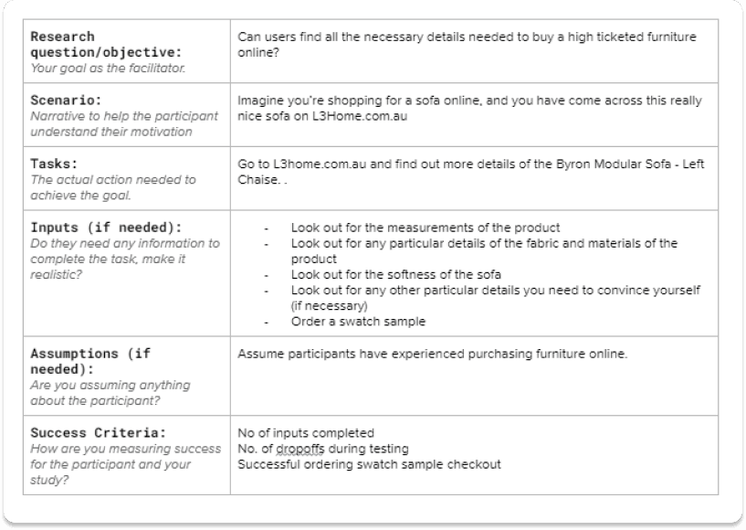
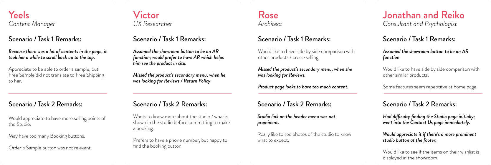
I constructed two usability scenarios based on the HMW statement — mostly task-driven, though left partly open-ended to keep the process natural.
Conclusion
The prototype proved we were heading in the right direction. Users were generally impressed — they could feel a sense of identity, and a lot of necessary details were there to convince them to make a purchase. Even those who didn't go for swatch sampling were happy to book an appointment (virtual or on-site) for a first-hand look.
There is always room for improvement. The prototype taught us that some elements of the visual hierarchy need further study and development.
Next Steps
- Making the product page clearer and shorter — e.g. having a "View More" button.
- Revisiting the visual hierarchy of the pages, moving some elements to positions users are used to (e.g. Showroom button, Reviews section).
- Considering integration of AR features in key products.
- Adding cross-selling elements into the listings.