
Mitre 10
Client Background
Mitre 10 is one of Australia's largest home improvement and hardware retailers. It operates a network of independently owned and operated stores across the country, known for combining local, community-based service with the buying power of a national brand.
Challenge and Objective
The business wanted to move away from its long-standing reliance on printed catalogues, and put that value into its digital assets instead.
The brief had asked us to re-evaluate the Mitre 10 online experience, along with the site's information architecture to improve its structure and content hierarchy while keeping the experience customer-first.
Problem Statement
Mitre 10's online experience wasn't flexible enough to serve customers and commercial partners at the same time.
User Experience Audit
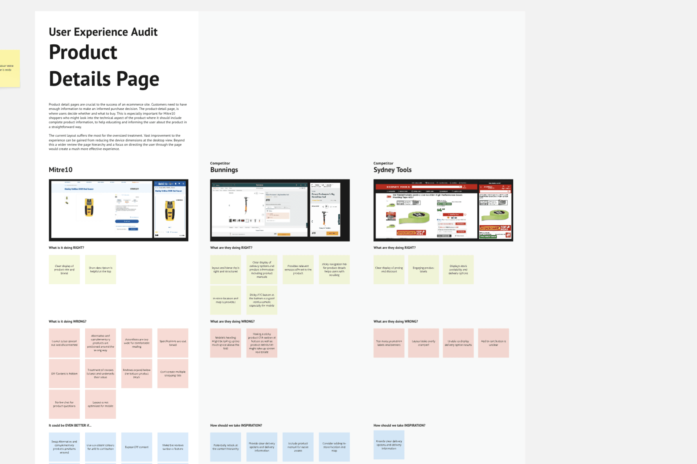
We ran a UX audit of the existing user journey to ground the project in first-hand evidence rather than assumptions, walking through the existing site against core usability heuristics — clarity of hierarchy, navigation logic, visual contrast, and content findability — to validate and discover potentially new pain points raised in the brief.
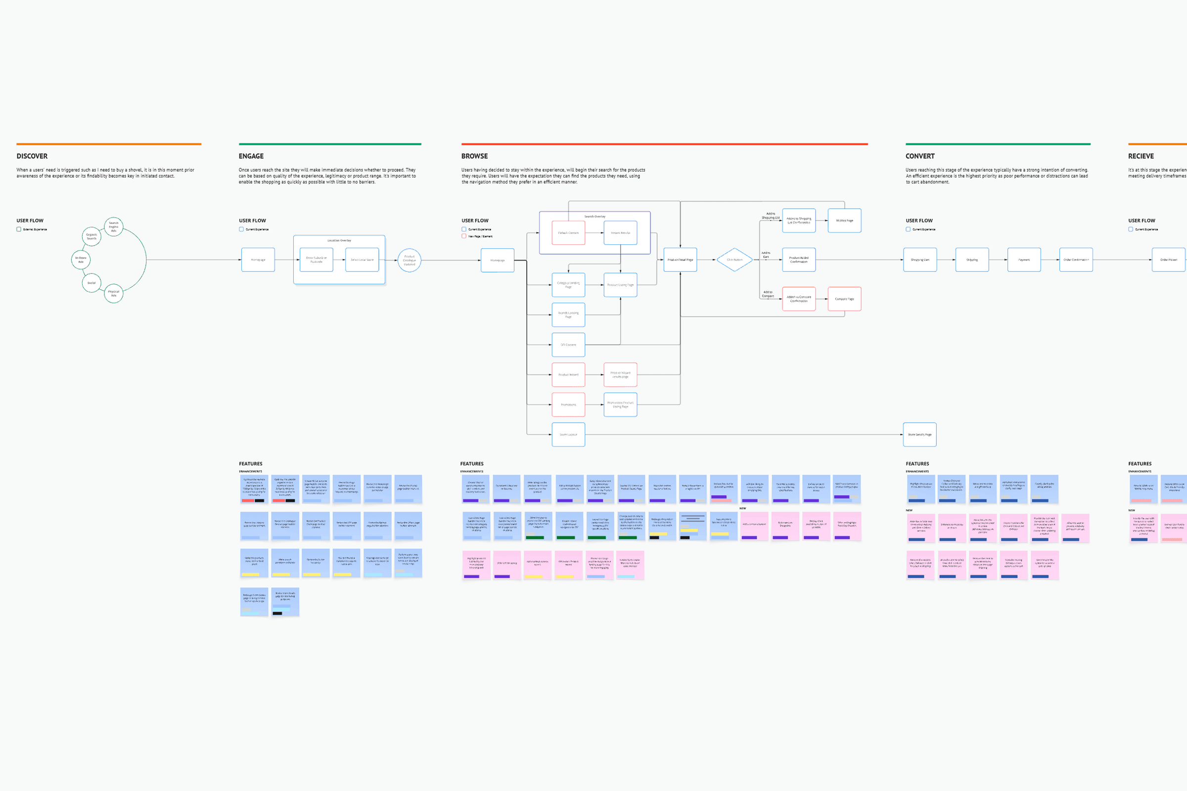
A feature list was also worked out by the solution architect team, mapped out based on each journey to ensure the scope and requirements are met. It gave the team a concrete, evidence-based starting point to test findings against in the benchmarking stage that followed.
Competitive Benchmarking
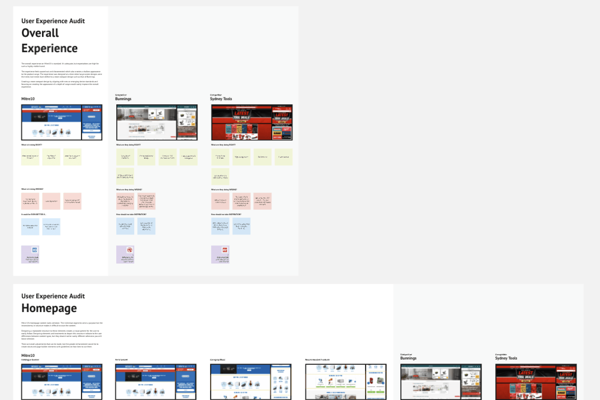
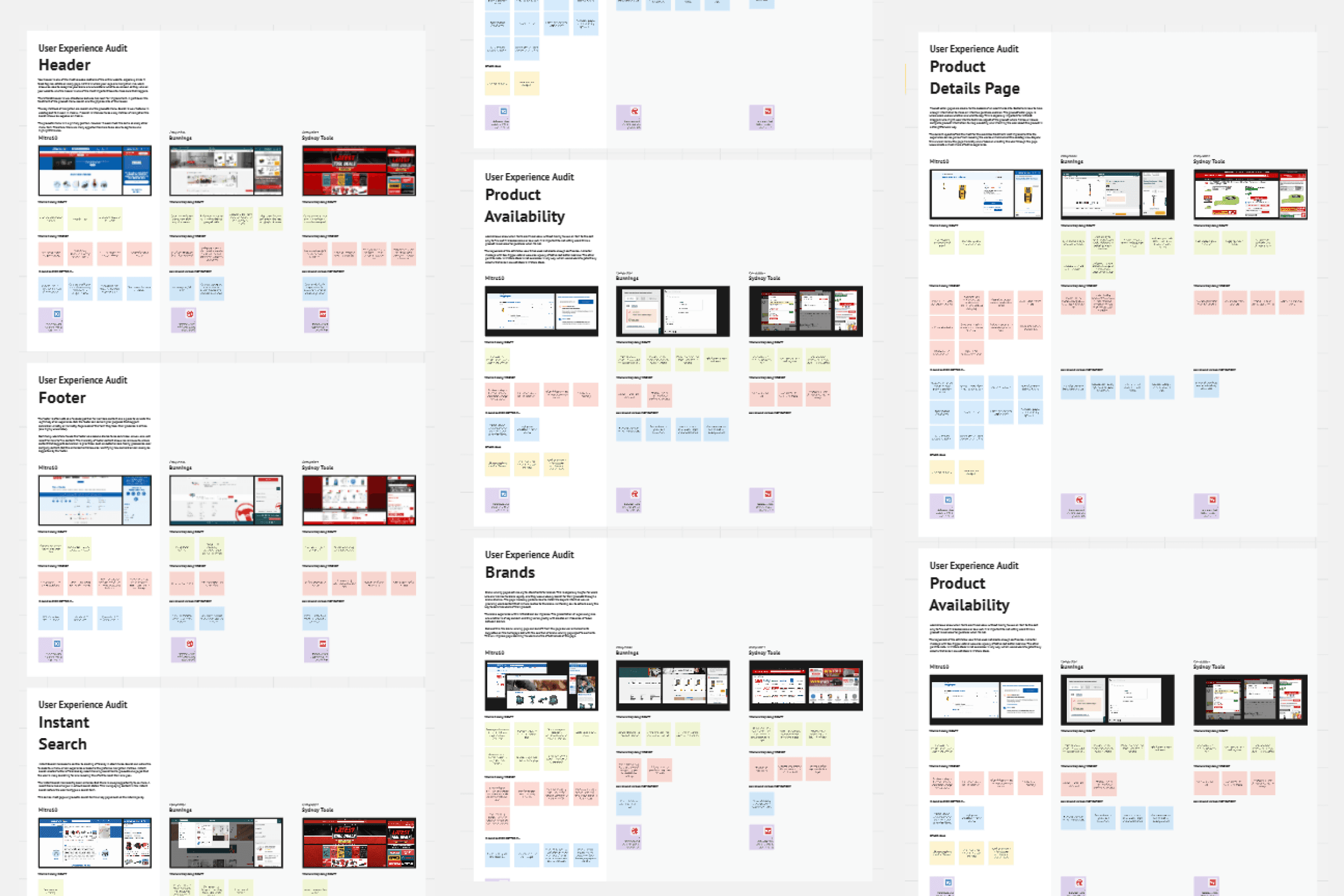
As a lean UX engagement, our research was grounded in the client brief and a structured benchmarking exercise against competitor and category-leading hardware/retail sites. While home page was primarily the focus on this exercise, we also did benchmarking on key touchpoints of the core user journey. Evidently, Bunnings was often mentioned as the clear main competitor, but we also included close competitors such as Sydney Tools to avoid a bias assumption of best practice in the market.
Insights
Benchmarking translated into a small set of guiding insights that shaped the design direction.
Lo-fidelity Wireframe
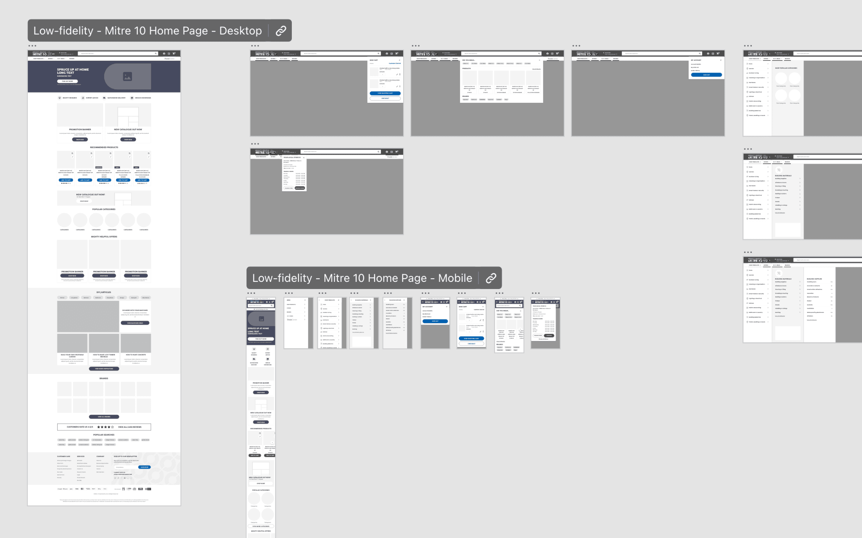
With insights defined, we moved directly into low-fidelity wireframing rather than a separate ideation phase — appropriate for a lean process with a tightly scoped brief. Wireframes explored a modular homepage structure as a base for other pages in the core journey.
Stakeholder Testing
Validation for this project was carried out through rounds of stakeholder review — checking design decisions against the benchmarking goals set out in Discover, and iterating the high-fidelity design based on that feedback.
Hi-Fidelity Design
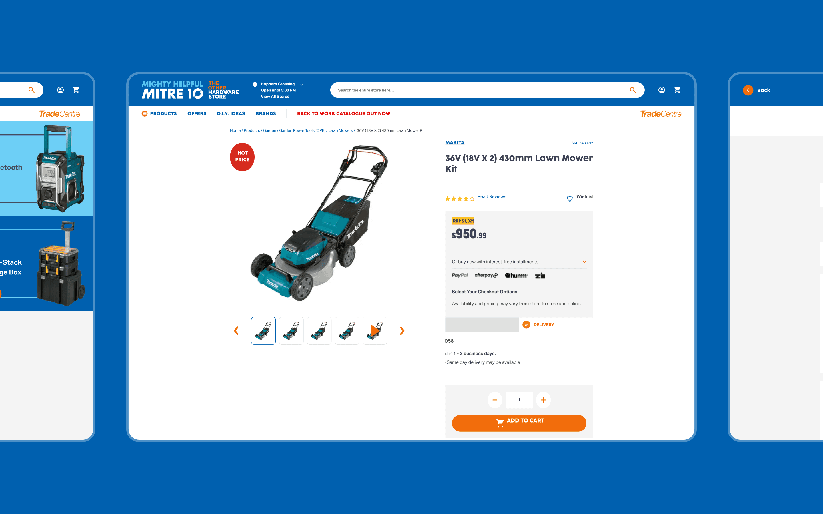
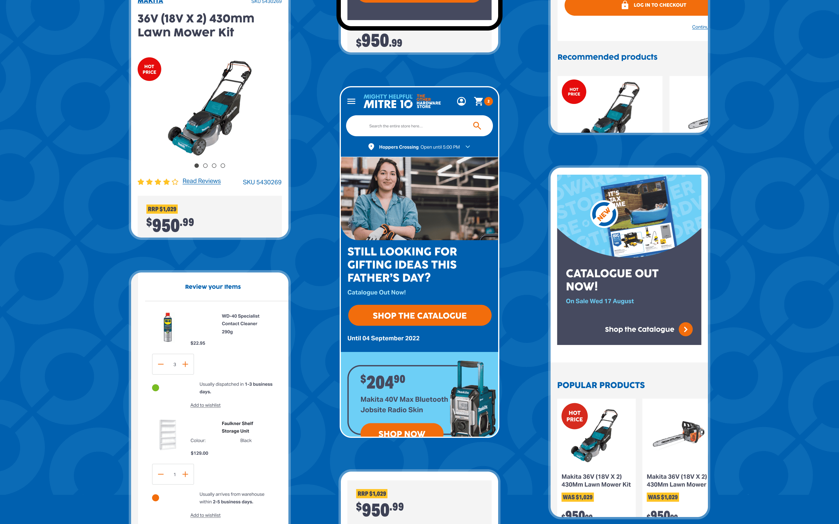
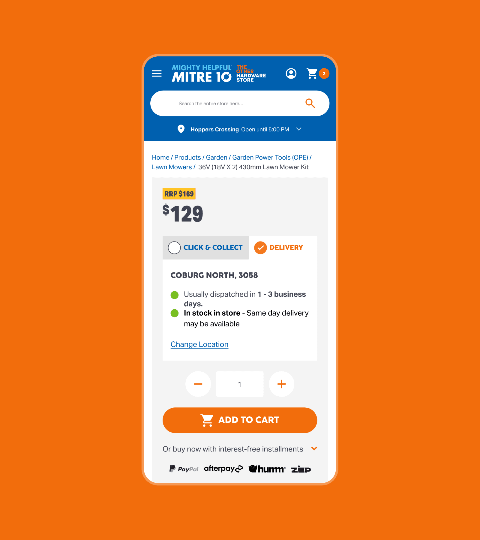
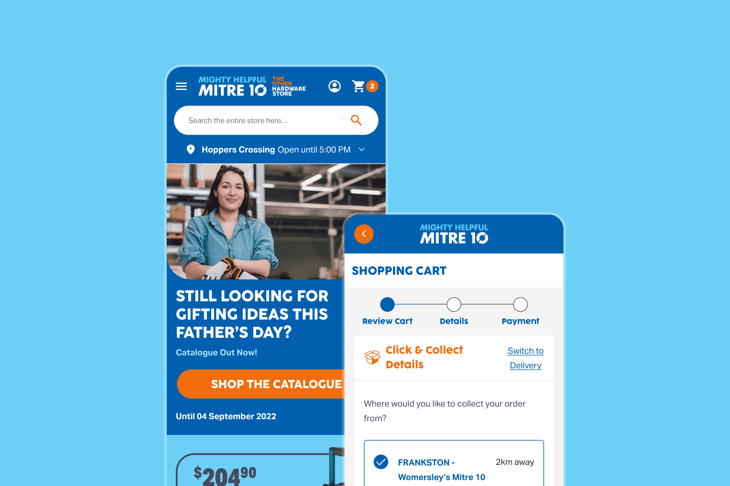
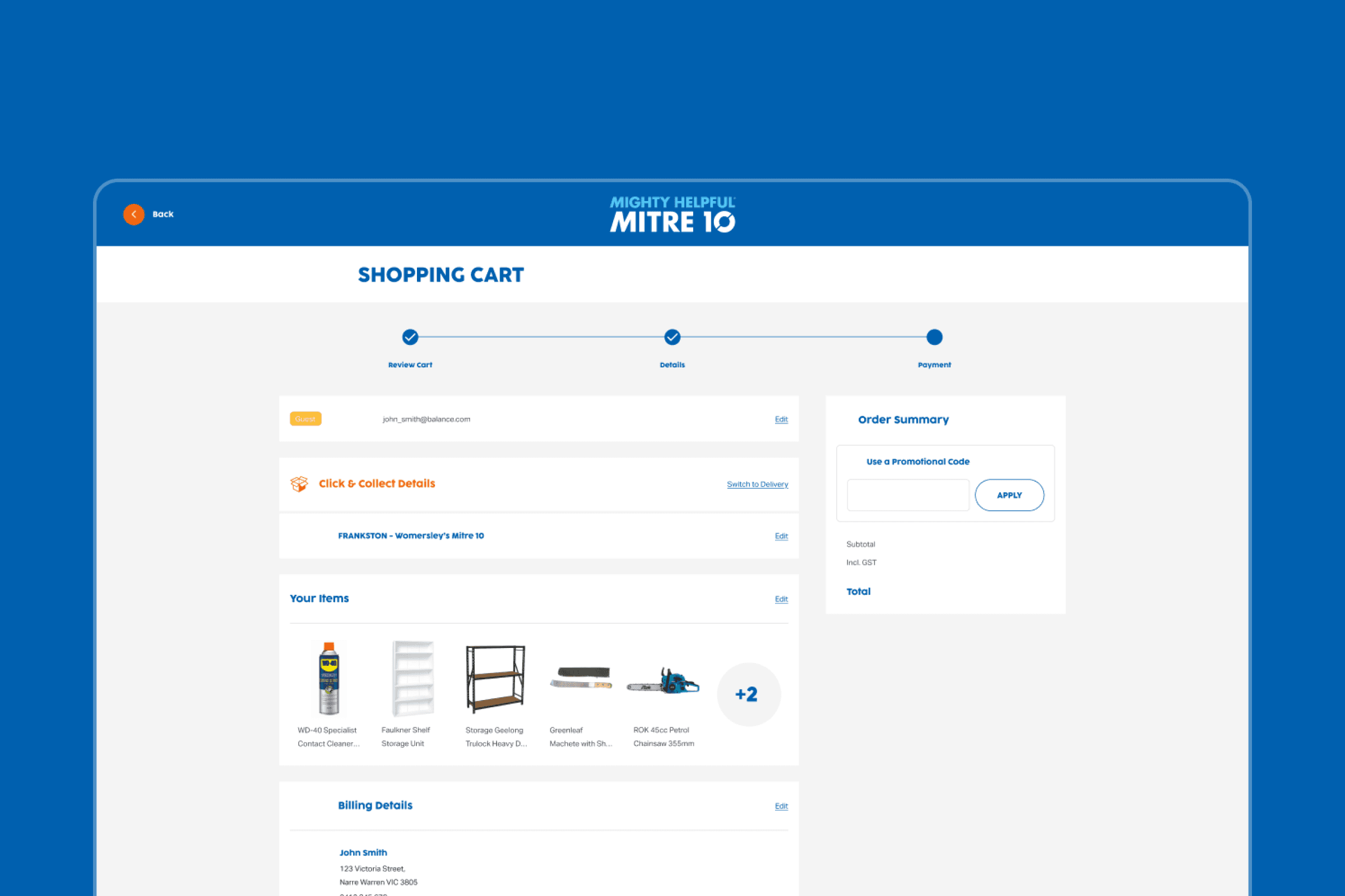
In the high fidelity design, we refined the visual system to integrate the new brand guidelines as well as addressing the contrast and brand-colour issues raised in benchmarking.
Style Guide Handover
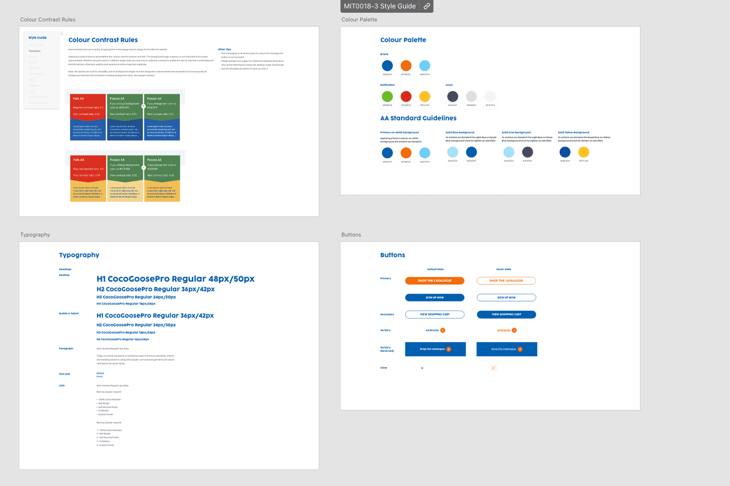
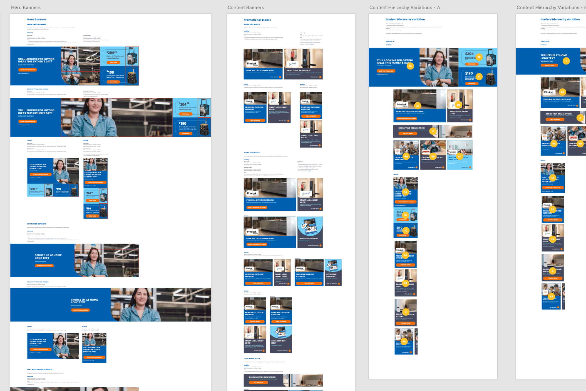
As the primary handover deliverable, we produced a style guide documenting the updated elements, giving the internal team a consistent reference for building and maintaining the new homepage template going forward. We also included a comprehensive guide for managing modular content components, providing a visual hierarchy guide to ensure the experience remains cohesive and balanced.
Conclusion
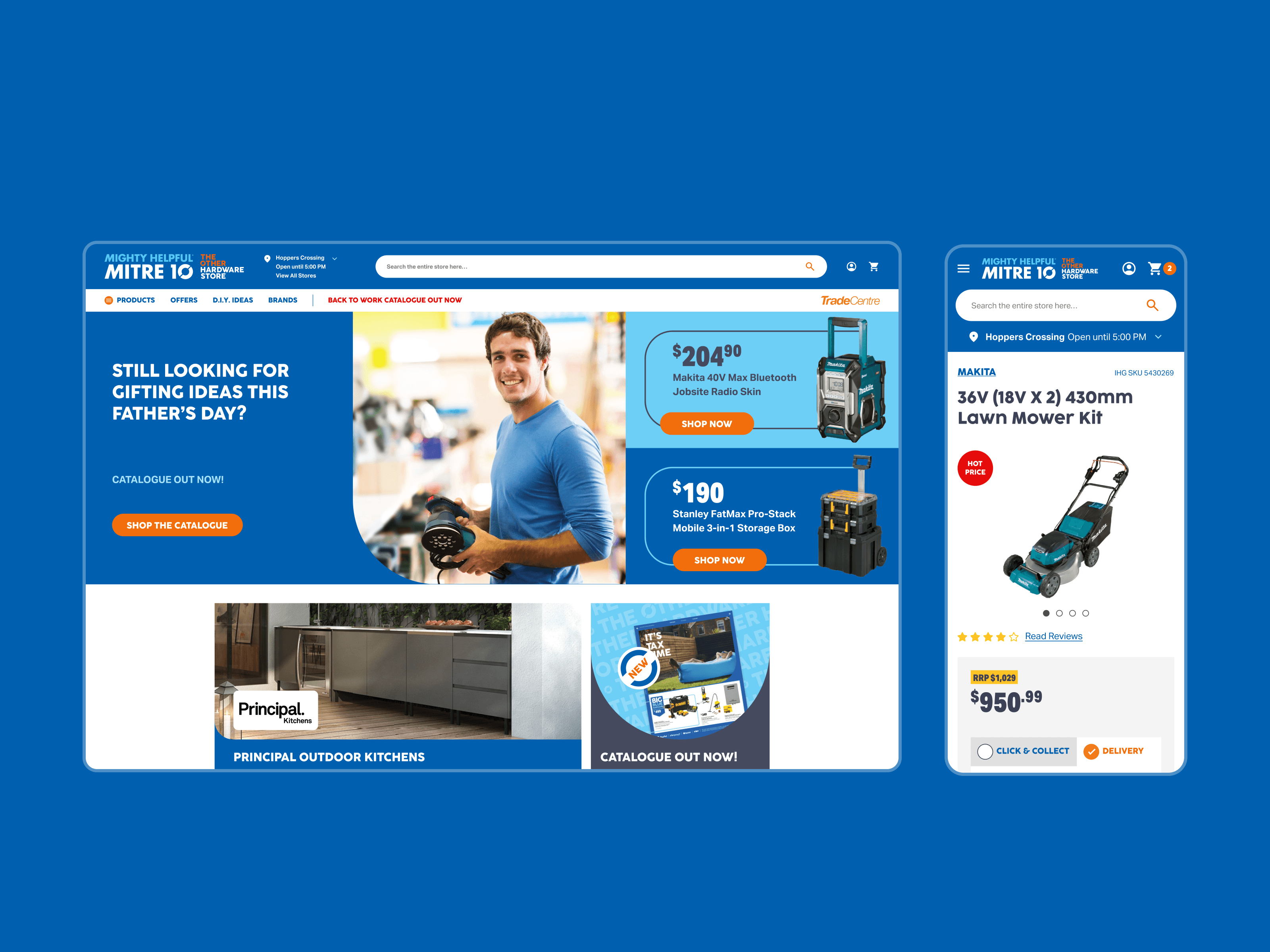
The redesigned homepage template gave Mitre 10 a more flexible, tiered content structure to support partners, alongside a clearer, higher-contrast visual system and more prominent service information for customers. The modular content system was then extended to complete the rest of the key templates (e.g. category and product pages), as well as adapting it to their sister brand, Home Hardware.
Success Metrics
This homepage redesign was part of Mitre 10's wider digital transformation — including a full platform migration to Adobe Commerce, nationwide fulfilment rollout, and consolidated brand experiences. Mitre 10 has since seen strong platform-wide performance gains, including.
- 315% increase in transactions
- 234% increase in revenue
- 6% increase in eCommerce conversion rate
Mitre 10 continues to work with Balance/Digitas to this day, with an ongoing partnership focused on evolving their digital experience and identifying new areas for improvement.